Photos and Features
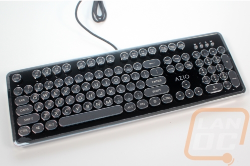
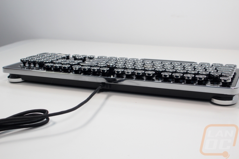
I’ve tested, reviewed, or owned just about any type of mechanical keyboard ranging from keyboards that fit in your pocket, keyboards that are split in half, and even huge monster keyboards that take up all of your desk but one thing is for sure, the MK Retro is the most unique looking of the entire bunch. The keyboard itself is designed with a plastic panel over the entire top that fits tightly around the top of each key switch giving the keyboard a look that is a little like the open Corsair keyboards. But the glossy black plastic finish, as well as the chrome, finish all the way around the outside edge is a lot more art deco than anything. The keycaps are of course the main focus but the overall design and the keycaps complement each other very well. That said the all plastic finish doesn’t give the same solid feel that products made back in that era had though the steel backplate for the keyboard at least help make sure it was still solid enough.
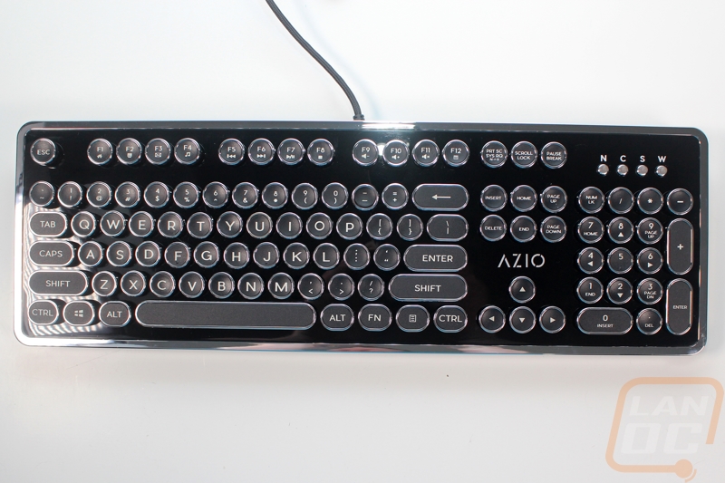
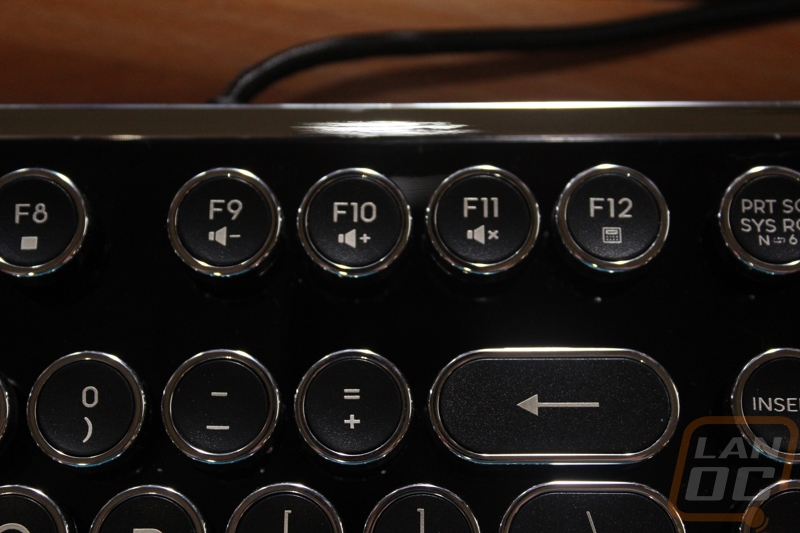
It is a traditional full layout and even with the unique keycaps they did stick with a standard bottom row as well. This means if someone really wanted to swap out the keycaps they could pick up any of the custom sets available on the market. This includes a full number pad and traditional spacing between the F keys, number pad, and direction pad area. Funny enough in these photos you can get a better idea of just how glossy that black finish is as well, in the second picture below you can see me taking the picture reflecting on it.
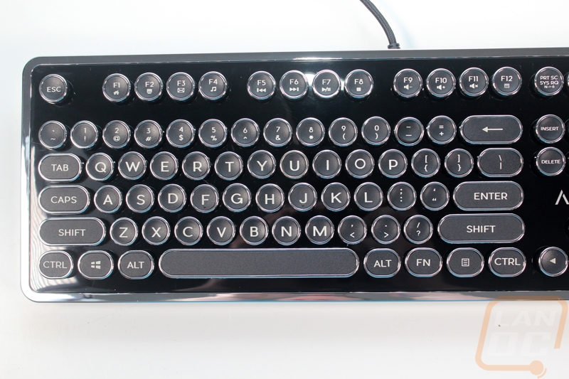
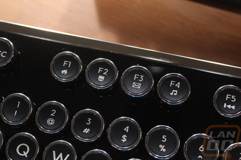
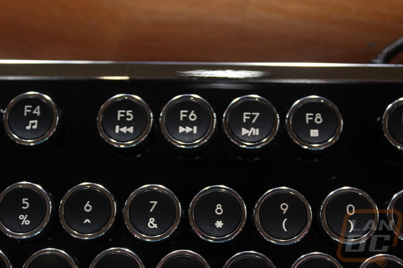
There aren’t any special keys or volume knobs but they did give the entire F key row double duty by using the function layer. So each key has been labeled with its extra function with things like the old school home and email buttons. There are also media controls and volume control as well like most keyboards these days have. Print screen also lets you flip between N Key Rollover and 6 key rollover for optimal bios compatibility while still having the N-Key Rollover support.
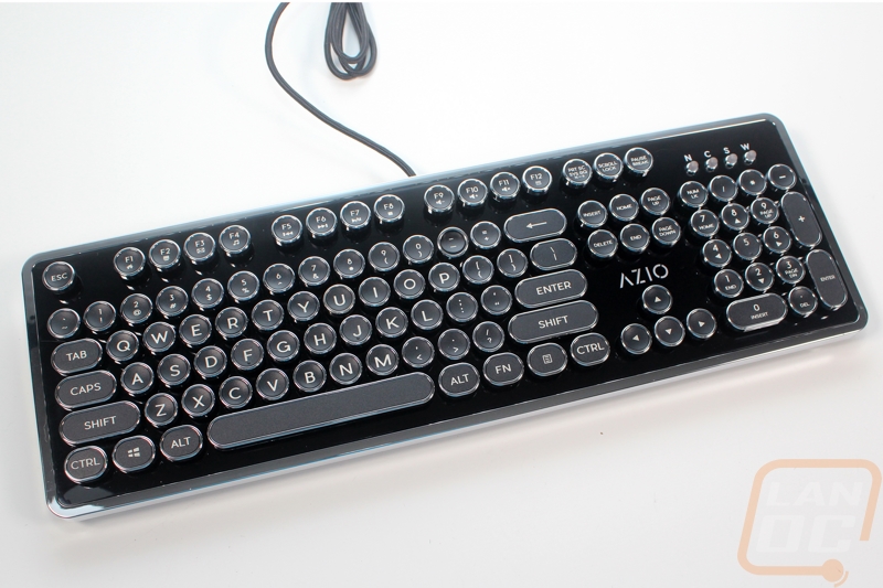
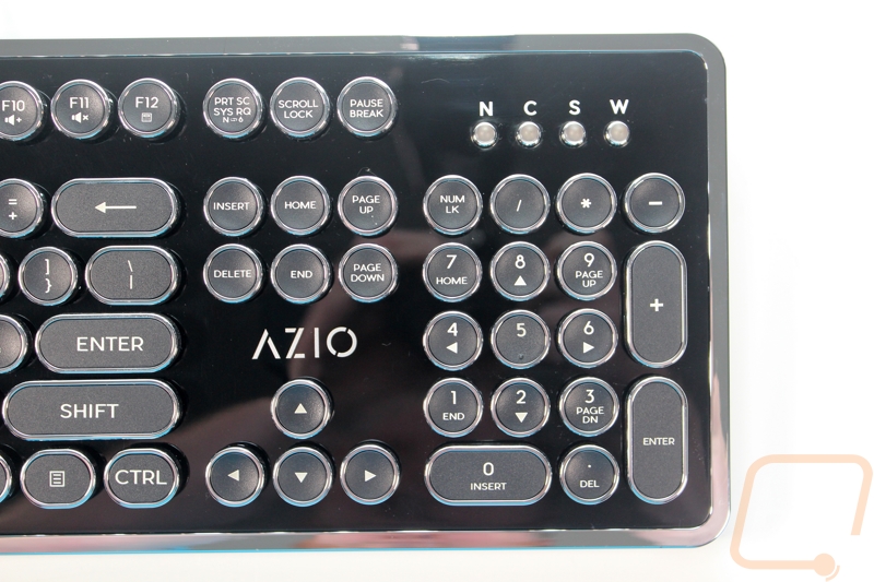
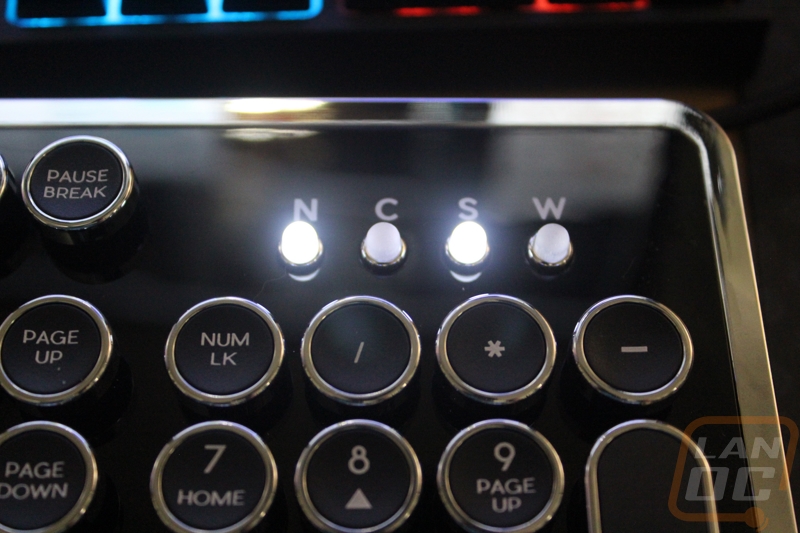
I typically prefer really tiny pinhole LEDs up above the number pad on my keyboards for the clean look but with this being a special case I do love the huge LEDs that have sticking up out of the keyboard above the number pad. These perfectly fit the look they were going with. There is a fourth light that you don’t normally see on keyboards. This is to let you know when you have the windows key turned off. You do this by pressing the function key and then the windows key at the same time to turn this on and off.
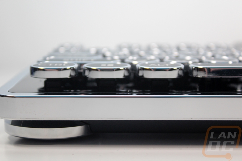
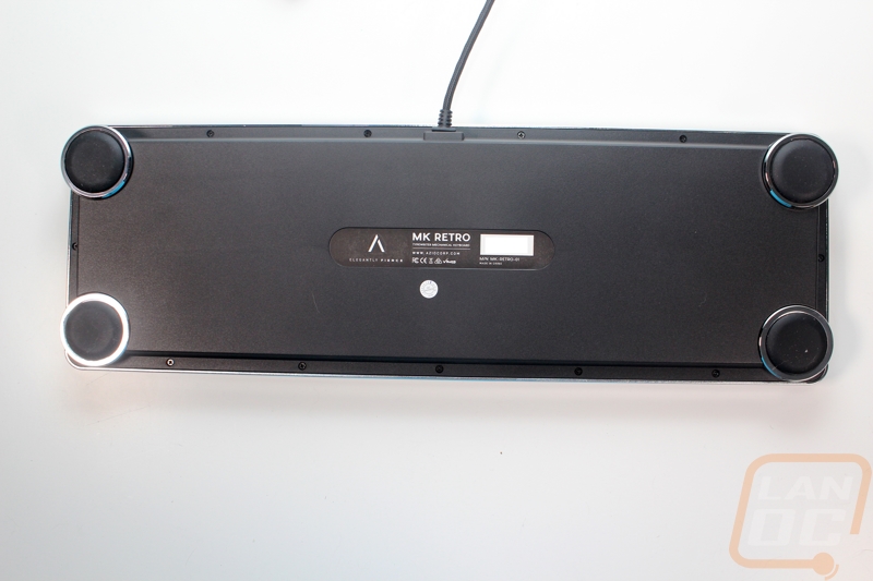
For feet, Azio went with a different design as well. The MK Retro has four round chrome feet, one on each corner. They each have a huge rubber pad under it. Even with the retro look, you don’t lose the ability to tilt. The rear feet can be raised by spinning the foot and the rubber pad in the bottom pushes out. Of everything about the MK Retro that is unique, this was the one thing that really caught me off guard. I didn’t expect them to go through that much trouble to redesign a basic feature to stick with the retro look. Sadly, only one of my feet worked correctly, though.
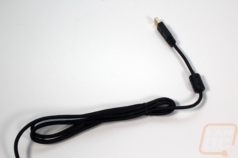
The only thing going on around the sides of the MK Retro is the non-detachable USB cable running out of the back of the keyboard. The cord is sleeved and at 6 feet long Is the standard length so it should reach your PC even if you have it sitting next to your desk, not on it.
Ignoring the four huge rubber feet that I already covered, the bottom of the MK Retro doesn’t have much going on. In the center is a sticker with the model information and a serial number bar code. There are also screws that run all the way around the outside edge that hold the plastic cover that hides the key switches to help give the board that typewriter look.
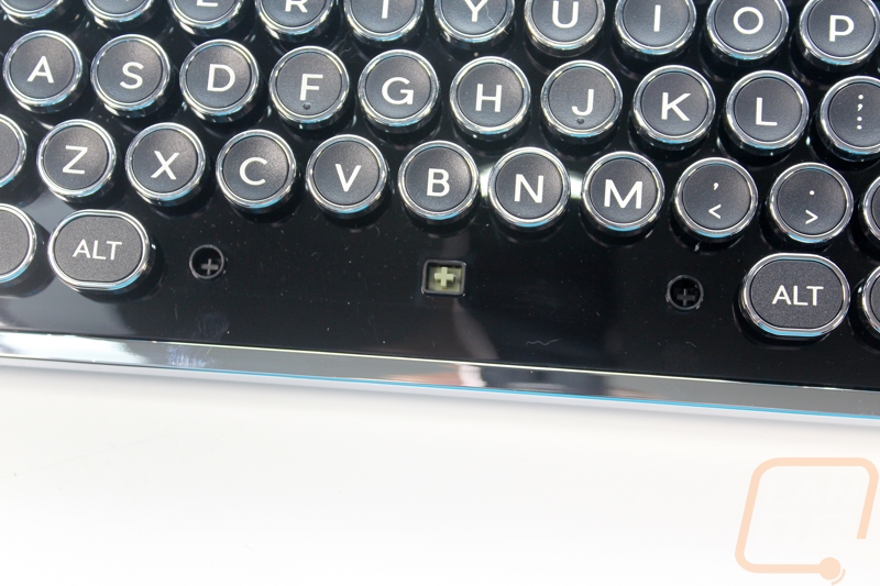
Speaking of the cover that hides the key switches, here is a better look at how the cover fits around the switches. Each key has a square the size and shape of the stem of the keyswitch. This cover up most of the switch leaving just the connection to the keycaps. With the switches being hidden it’s a little hard to tell exactly who makes them but in the past Azio has used Kailh switches and given the off green color what we see on the stem I’m guessing that hasn’t changed. The switches on are Cherry Blue clones with a distinct click sound and action when pressing them. This isn’t a surprise at all as it is the switch that best replicates the old typewriter click. Under the spacebar, we can see that for stabilizers Azio went with a cherry like stabilizer to keep everything hidden under the top plate.
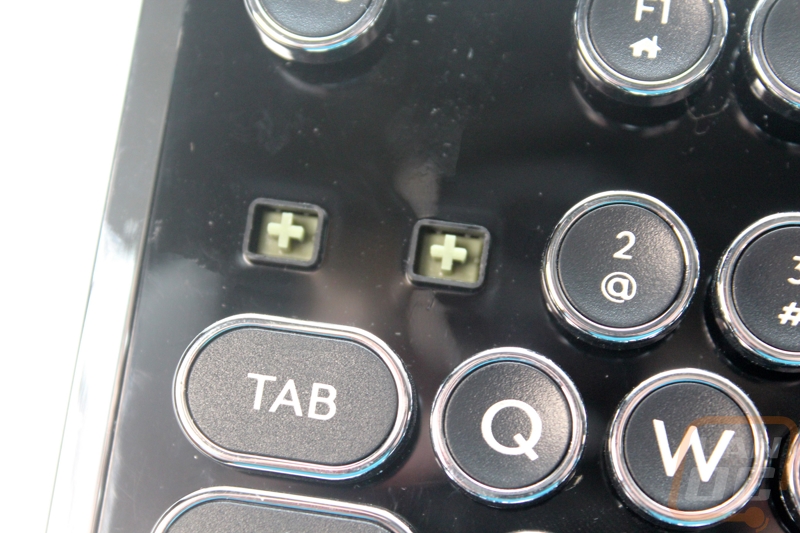
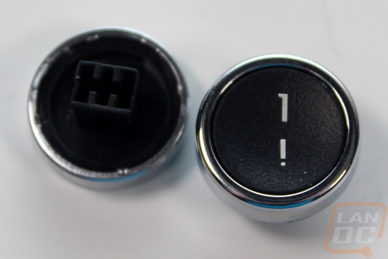
It’s the keycaps on the MK Retro that really bring everything together. Each keycap is round and indented just like a typewriter. They are black in the idle with a chrome ring around the outside. Compared to the Datamancer keycaps (that I haven’t seen in person) they look a little different because they don’t have the glossy top finish and all of the modifiers on the MK Retro are rounded as well where the Datamancer caps aren’t. They are made out of ABS so you can expect them to wear down to a glossy finish after heavy use. The stem design is completely different than I expected. Most keycaps have a round stem with the cross inside but the caps on the MK Retro have a rectangle stem. This fits perfectly in the cover that hides the keycaps, making it so you can’t see any of the switch when looking under the keys. This does mean that the keycaps might not work on every keyboard should you want to pull them off and use them on something else. The legends look good with a basic font that fits the time period. Sadly the legends are pad printed on. That combined with the ABS cap material is going to mean the legends will wear off over time.