Design
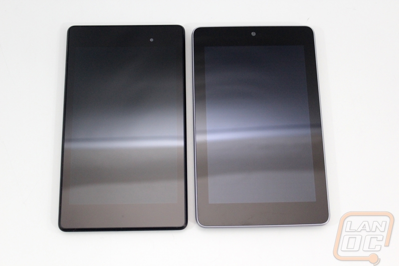
My initial thoughts on the Nexus 7 2013 were that the design is extremely similar to the previous design. Size wise they are very close with the exception of the thickness. Asus did drop the silver trim around the edge for a more “Nexus” blacked out styling.
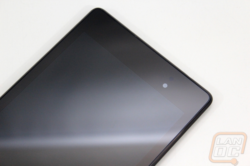
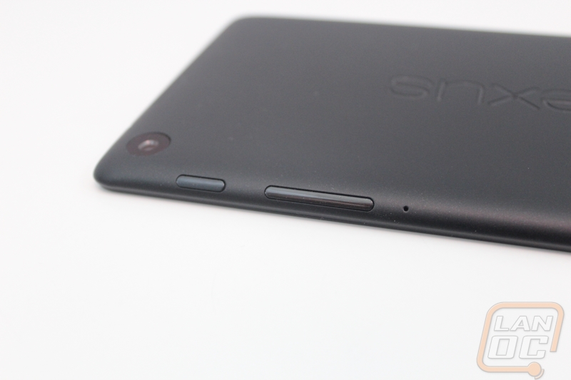
Starting up along the top of the front of the Nexus 7 2013 we can see the front facing camera and the ambient light sensor. The camera itself isn’t anything spectacular but at 1.2MP it is enough to get the job done. This is basically the same camera that the previous generation used as well. With so many people doing selfies I’m surprised their hasn’t been more of a focus on improving the front facing camera.
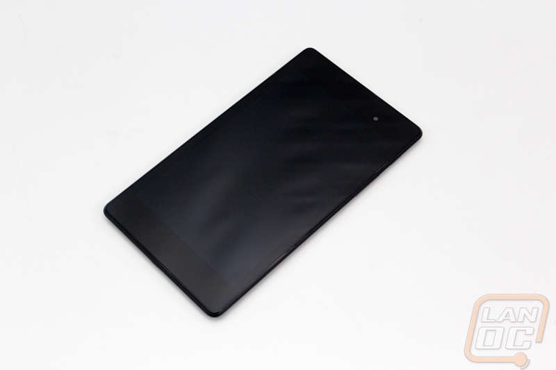
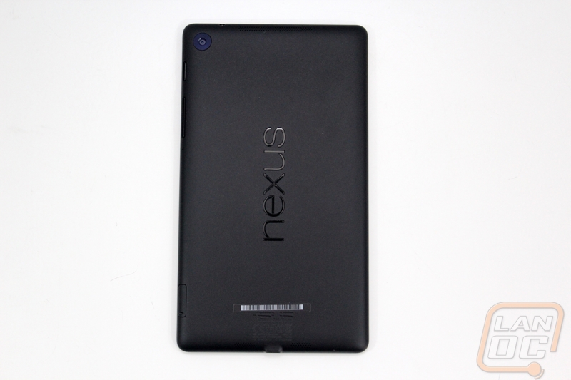
As always the Nexus 7 2013 has an extremely clean design without any logos down at the bottom. In the photos below we can just barely see the hidden notification LED that flashes when you have messages. If you look close you can also see how wide the screen bezel is, down on the bottom there is about an inch but the sides are closer to a ¼ inch on each side. It doesn’t go all the way to the edge, but it is an improvement over the original.
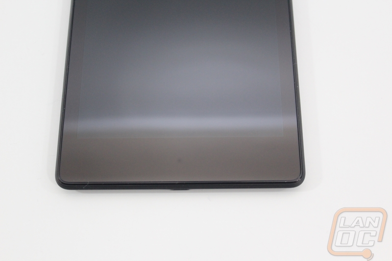
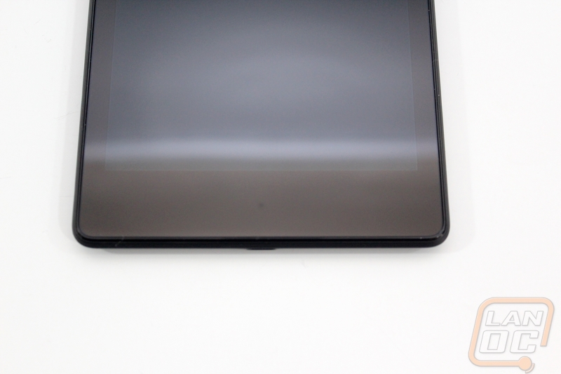
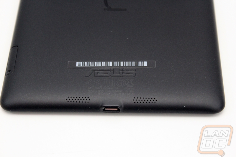
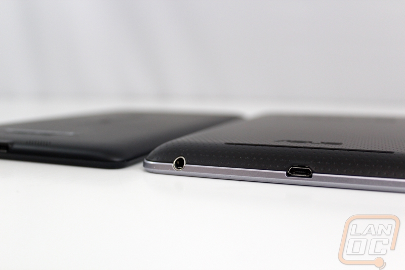
Down on the bottom edge in the center is the Micro USB data/charging plug along with what looks to be two small microphone or speaker vents.
The right side of the Nexus 7 2013 is where you will find the power and volume buttons. This is a fairly standard location for both so moving from most android phones to your tablet shouldn’t have you fumbling around unless maybe you have an LG G2 with its weird power button location. Also farther down is the SIM card tray, as usual you push the small tool in the hole to push the tray out. BTW the small hole below the volume rocker is the microphone hole, don’t go sticking anything in there if you are trying to hard reboot the tablet.
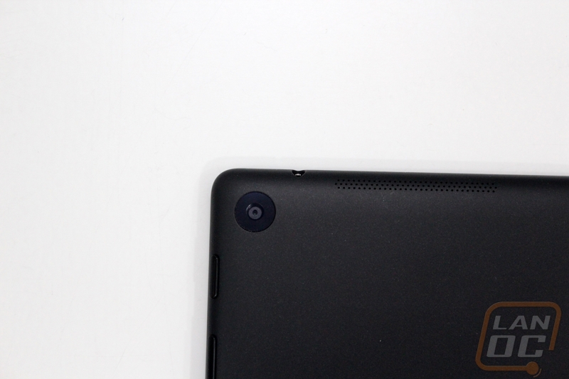
Up on the top edge is the headphone/microphone jack as well as the main external speaker.
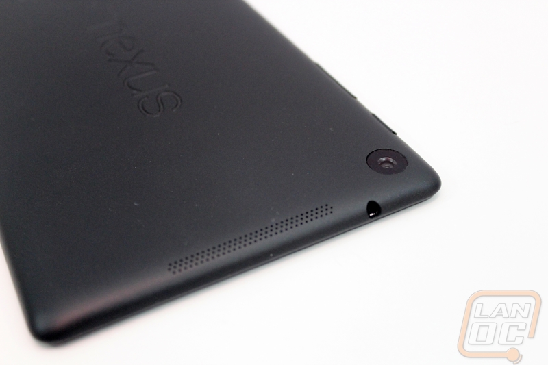
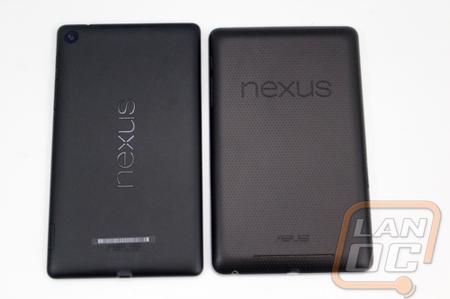
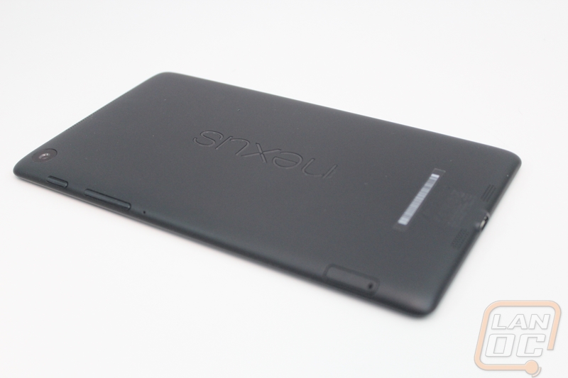
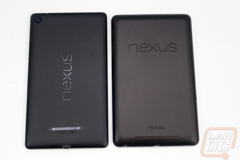
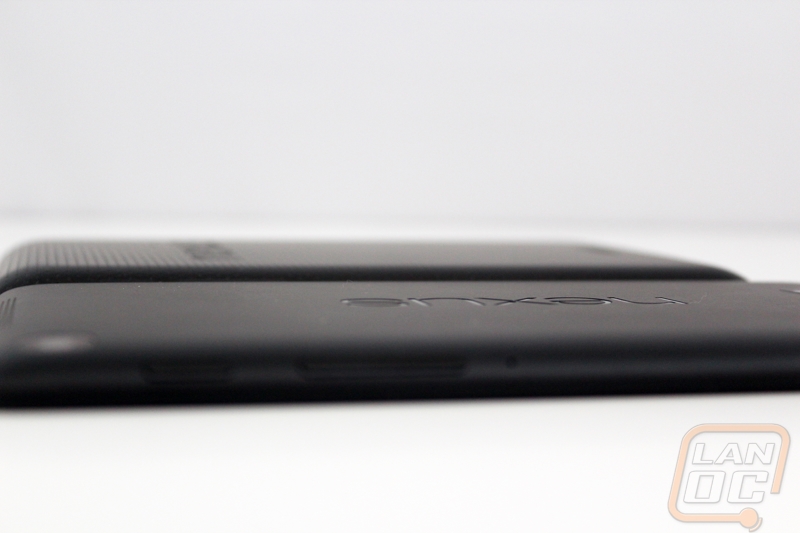
Around back the texture of the previous generation is gone and we have a slightly smoother feel/look. You still have the Nexus branding carved into the back like before. As always I love that the Nexus devices always have a clean look that avoids lots of branding and colors. The only other things going on in the back are the serial number down at the bottom and the rear facing camera up in the top left. Yup that’s right they finally broke down at added one, that was one of the biggest downsides to the original Nexus 7. You get a 5MP camera with auto focus but no LED flash, so it isn’t the best camera on the market, but it is much better than nothing at all.
The best way to actually spot the differences between this tablet and the previous model is to put them next to each other. My initial impression was that the main difference was in the thickness. The 2013 model is actually slightly longer and about a ¼ inch skinnier as well. This in addition to the thinner design makes the newer model a lot easier to hold in your hand. The older model is slightly heavier as well with the older tablet coming in at 340 grams and the newer one at 290 grams. They were able to get thinner and lighter by lowering the battery capacity down slightly, we will have to see if they changes the usage time in the performance section.
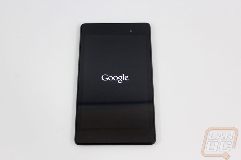
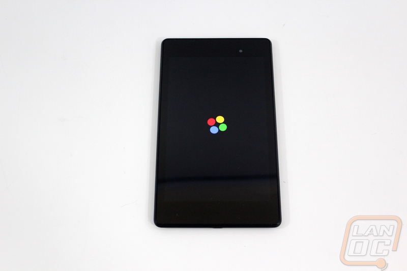
Last but least here are a couple shots of the Nexus 7 2013 booting up before I jump into performance testing and talk about my time with the tablet. The 7 inch screen has a resolution of 1920 x 1200 that makes for 323 PPI (pixels per Inch). That is an interesting resolution because a lot of devices aim for a pure 1080p resolution, but this will allow buttons at the bottom of the screen without interrupting your 1080p playback.