Photos and Features
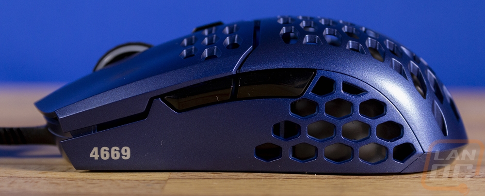
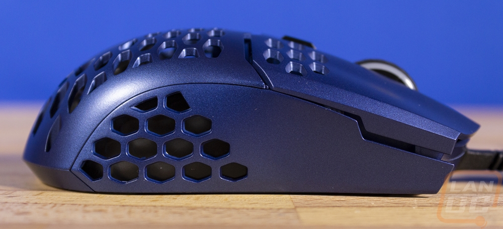
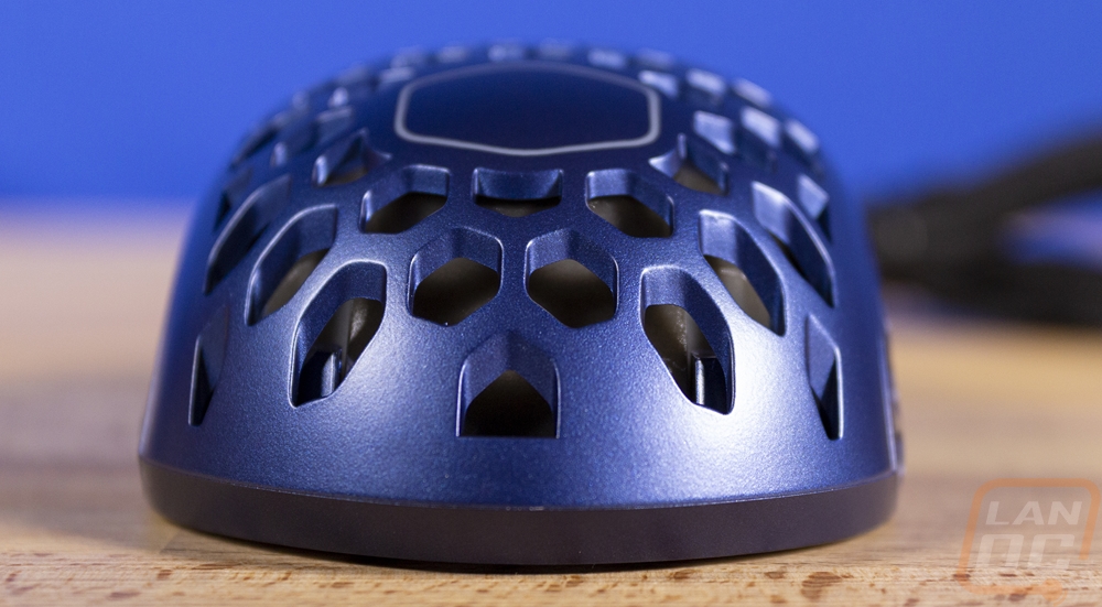
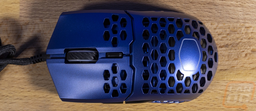
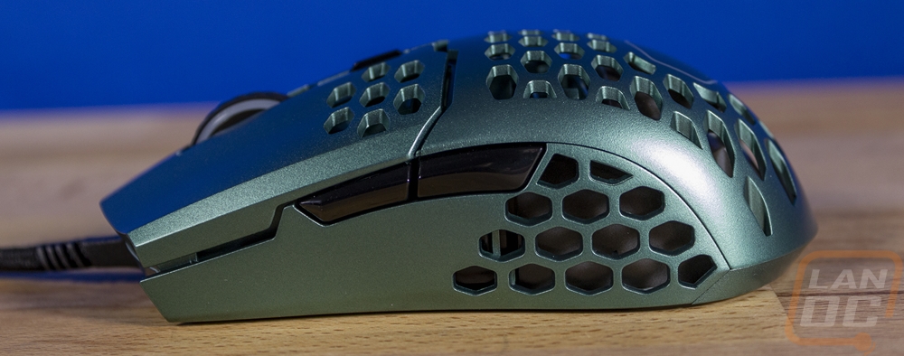
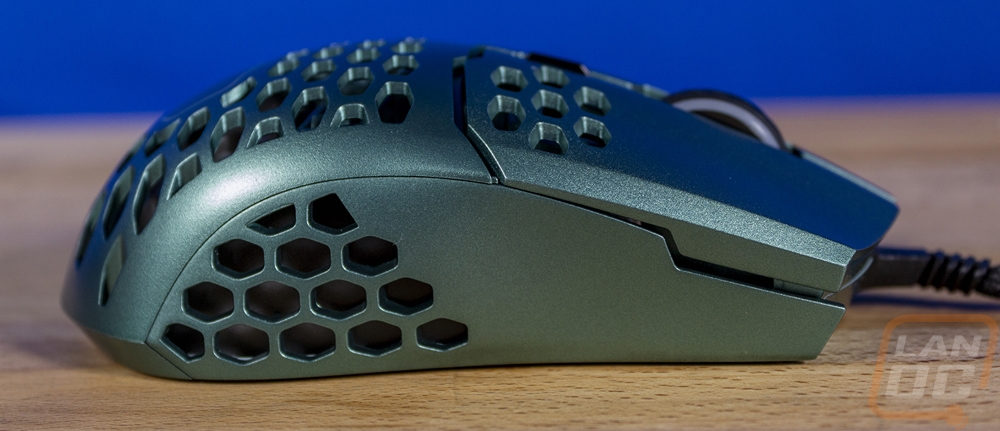
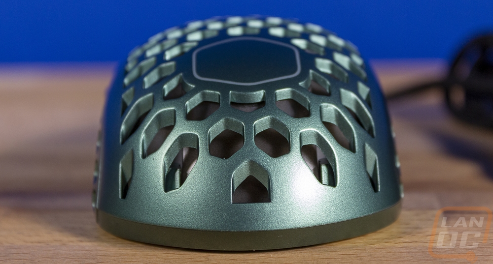
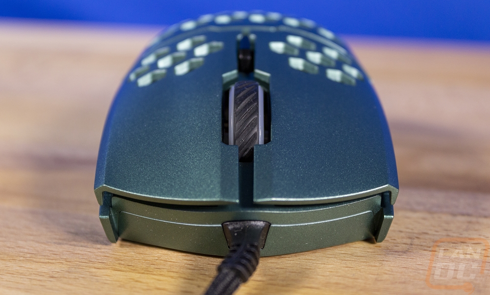
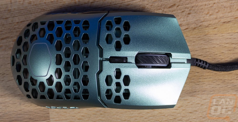
So I’ve covered both the MM710 and the MM711 which have the same design except the RGB lighting added on the MM711. So rather than do a full detailed look again with these colorways I want to reference both of my previous reviews (MM710 and MM711) which go into more detail. But I did want to at least touch on the main features of the MM711. The most obvious feature is of course the honeycomb design which covers all of the top except for the triggers and is on both of the sides at the back of the mouse. This combined with the overall size helps the MM711 have a weight of around 60 grams. Lightweight isn’t new, but it is finally seeing mainstream and the point is that a heavier mouse will mean slower changes in direction and over long periods of time more stress on your wrist.
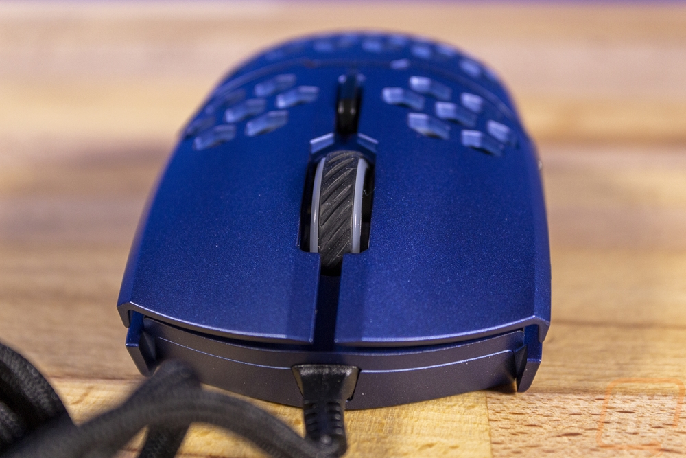
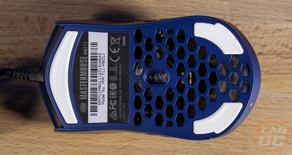
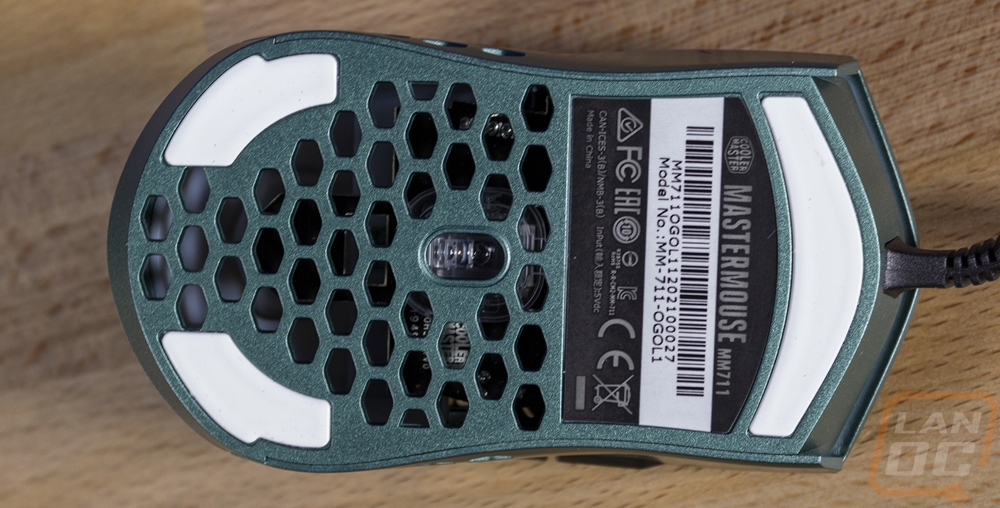
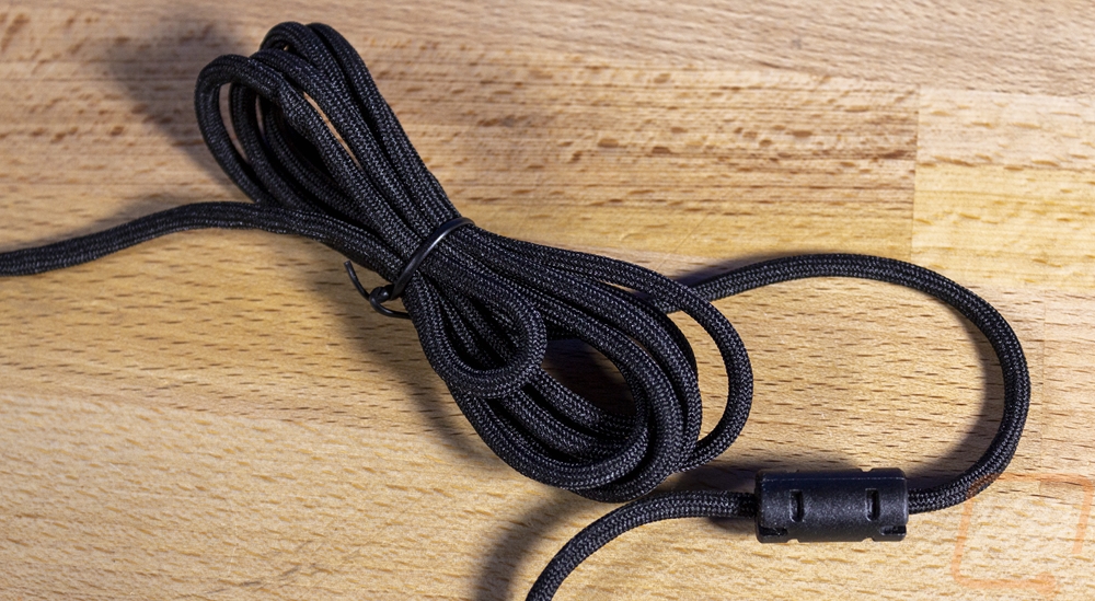
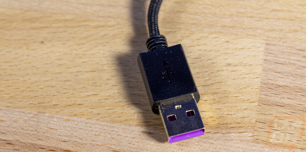
Both MM711’s also have other features taken right from the mouse enthusiasts modding playbook and yes there are LOTS of people who mod their mice to get the best possible performance from them. They love switching to PTFE gliders which slide smoother so Cooler Master went ahead and included them on the MM711. Then for the cord, the enthusiasts like to sleeve their mice to a softer sleeving so it is more flexible and doesn’t catch on things (as well as for colors as well). So the cord on the MM711’s is what they call an Ultraweave. It is as soft and flexible as a shoelace even with the cord inside. Making sure the cord inside is also flexible which I assume is with a silicon covering not rubber. This might not seem like a big deal, but the Ultraweave cable is so flexible that you could put something on the cord at the end of your mouse pad and not even notice where with a stiff cord it would make it hard to use the mouse. For switches, they used OMRON 20 million click switches which have a solid click that I love. Then the sensor is a PixArt PMW 3389 which is a flawless sensor that runs up to 16,000 DPI, not that you need anything close to that. Then for the MM711 they added a white diffused panel up under the holes in the housing which works with the RGB lighting to light up the Cooler Master logo under your palm and the Cooler Master logo shaped holes on the top and sides.
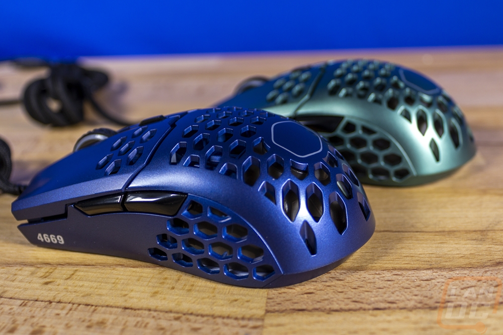
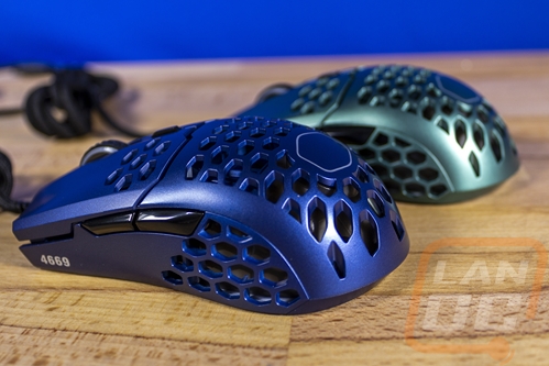
So obviously the big thing with the colorways is the color itself. The first model they have is what they call wilderness green. When I saw Cooler Masters pictures of this I thought it looked a lot like a Baylor or Michigan State green but once I had in person it was completely different than expected. Their pictures have it looking a lot richer of a green. What you get though is a lot more metallic which looks different at every angle that you look at it. Their green looks a LOT better than any of the car colors with the same name, seriously google the color name, they look terrible. I think I would prefer a deeper green or even a wilder bright green myself, but it is a unique color.
The second color is what they call Steel Blue which should have a lot of people thinking of Ben Stiller doing his signature look from Zoolander with the same name. But the color is a deep blue with a touch of purple with the same metallic finish that the wilderness green has. This again has it looking different depending on where you look. This one also is numbered on the front left corner which our wilderness green didn’t have in a silver that perfectly matches the blue. While this isn’t your standard blue by any means, it is a lot more of a mainstream color, and of the two colorways it is the one I like more. But the best part about colorways is that they can offer different colors for people with different preferences.