Photos and Features
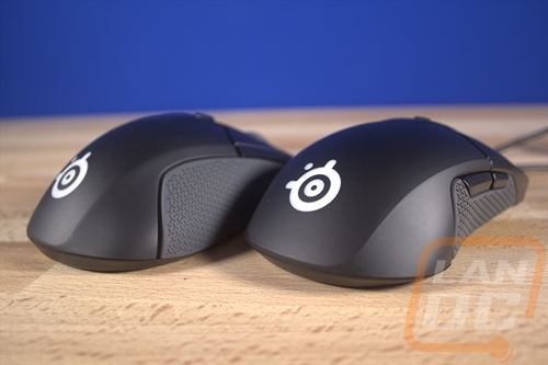
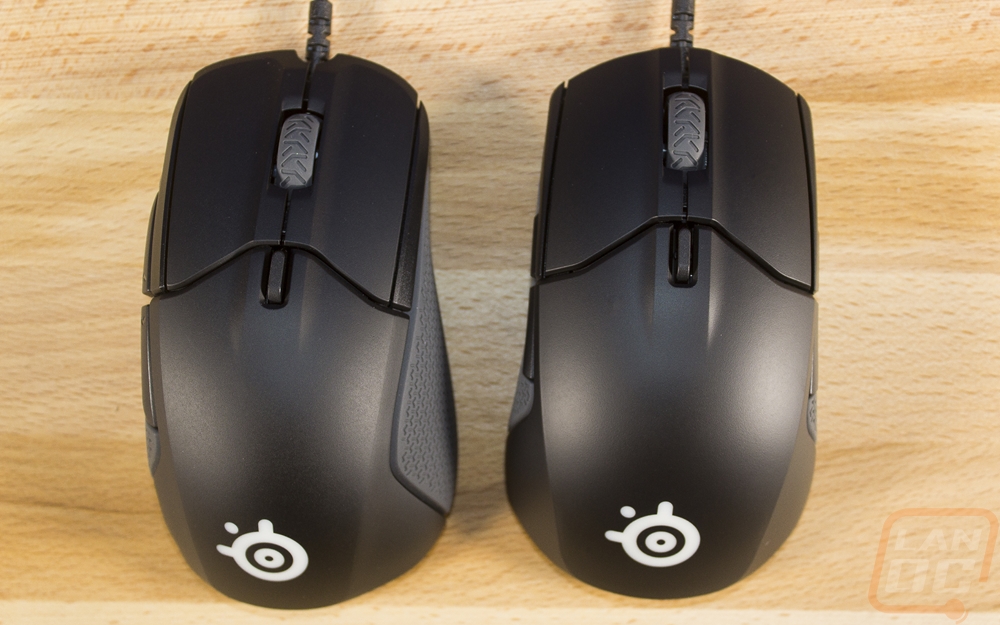
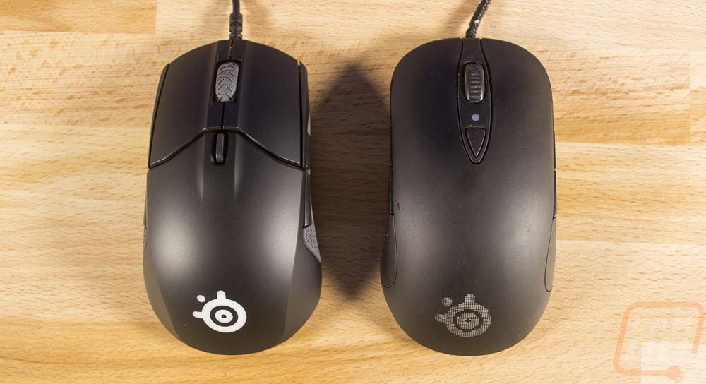
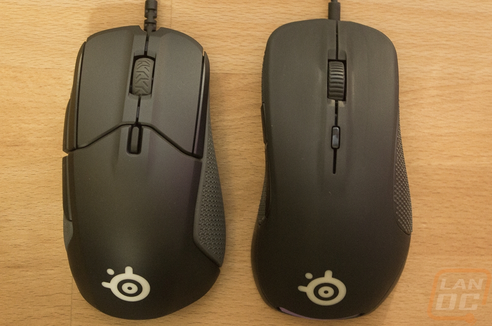
So here we are, the pictures below have both the Rival 310 and the Sensei 310 together. Can you tell the difference between the two? So right out of the hole, you will notice that the modern SteelSeries styling that was introduced with the original Rival is now on both mice. This mostly consists of the small body line that runs from the triggers all the way to the back of the mouse and grips on the side of the mouse. I say modern because the Sensei, Xai, and Ikari all had a slightly cleaner look without grips or styling lines. They did update the look a little by adding gray in with the grips on the side where in the past, even as recently as the Rival 700 the grips were black. The SteelSeries logo under your palm is much brighter than in the past as well where they used to try to hide it with a grid design in the outside finish that would only really be visible when the lighting is on. Anyhow if you still haven’t figured out which mouse is which I can help. So the Sensei is an ambidextrous design like it always has been and the Rival continues to be a right handed ergonomic design. So you can spot the difference when looking at the shape, the Sensei is a little less wide and both sides are the same where the Rival 310 has a wide right grip area. Or you can keep it simple, the Sensei has buttons on both sides and the Rival doesn’t.
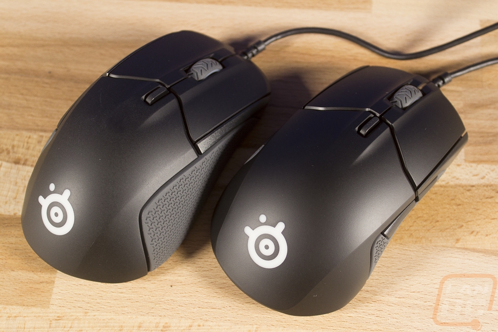
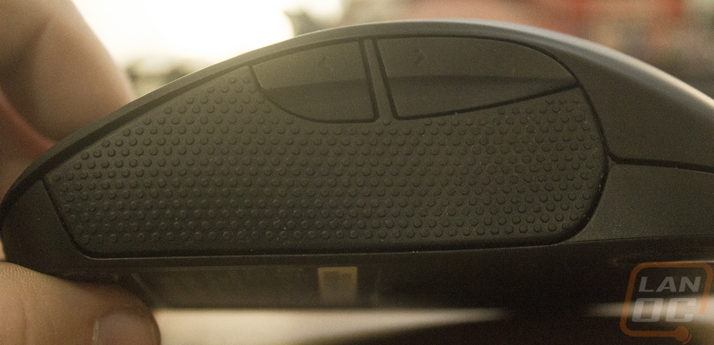
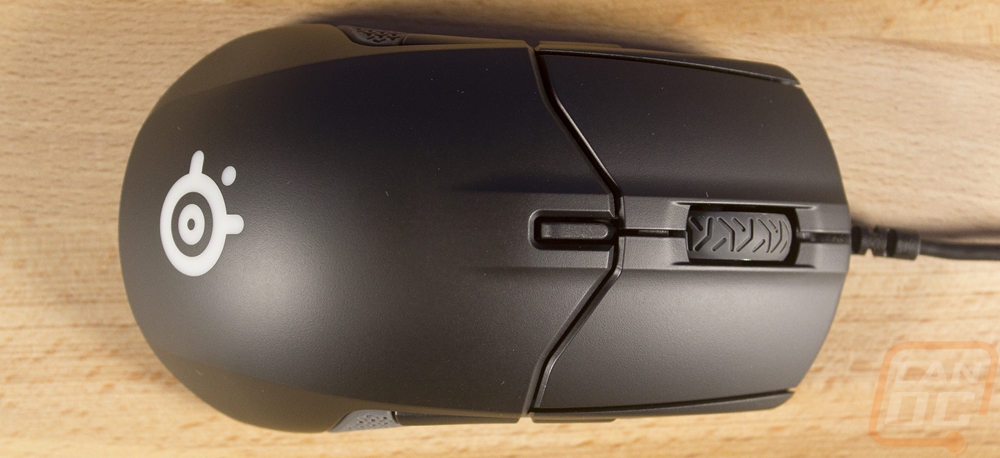
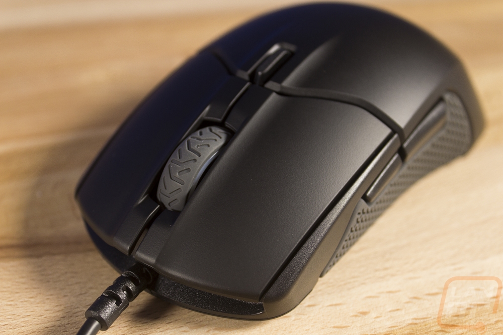
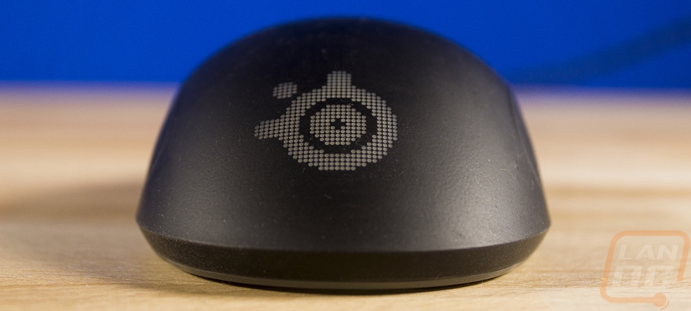
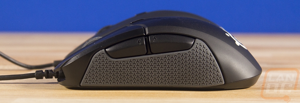
So here is the Sensei 310, when looking down from above we can really see the ambidextrous design. The body lines that go from the triggers help us see that both sides stick out the same, a little more in the rear and getting smaller towards the front. Up on top, we have two main triggers, they have now been split off from the rest of the top. This is a current trend, people feel like it gives a more solid click. Under the triggers, SteelSeries went with Omron switches rated at 50 million clicks. Also on top, you have the scroll wheel sitting between the triggers. It has a new rubber grip, dropping the straight lines of the original Sensei for more random lines. Hopefully, the new design has an improved scroll wheel design, that was the main failing point for the original Sensei. Then last but not least, behind the triggers there is a small plastic button. The original Sensei had this as well only it was flush with the mouse, this design sticks up slightly. The button flips between your two CPI modes.
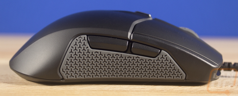
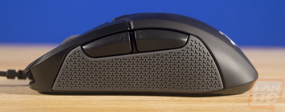
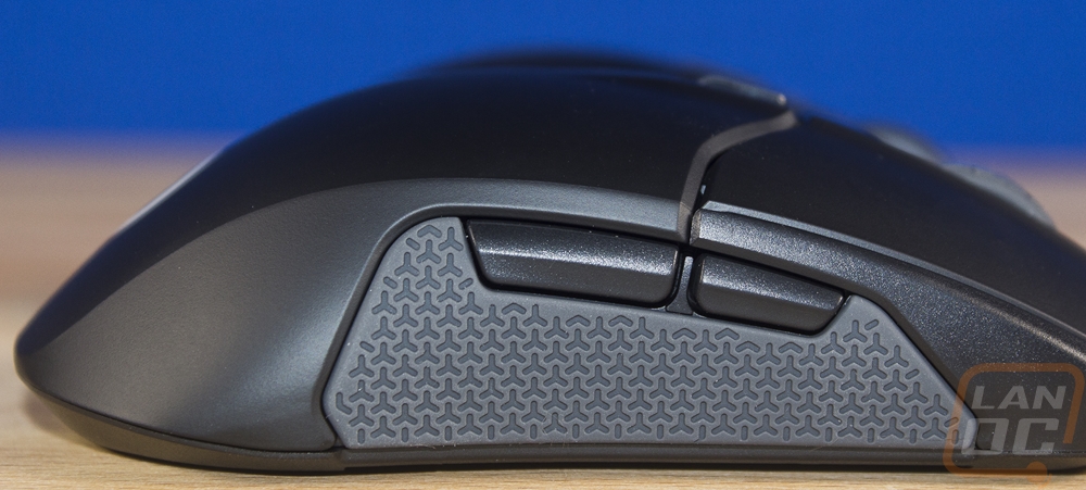
For the sides, we might as well look at both sides of the Sensei 310 as they are the same. There are two side buttons on each side. From what I can tell the buttons themselves are the same size and shape as the original design with the rear button being thicker and longer. They did move them just a hair, lining up the gap between the buttons with the new break in the top for the triggers. Then on the sides, they added grips… I’ve never been a big fan of grips but this design is at least different. For starters, SteelSeries dropped rubber altogether. They had major issues with the rubber degrading and completely falling apart on the Rival due to body oils, moving to silicon should mean long life and a little extra grip. Then the design itself has changed as well, they used to use small circular bumps, now the grip has a three peg design that is now embossed into the grip, not out of the grip. I will talk more about this design in my performance testing, because grips have been a big sticking point for me in the past.
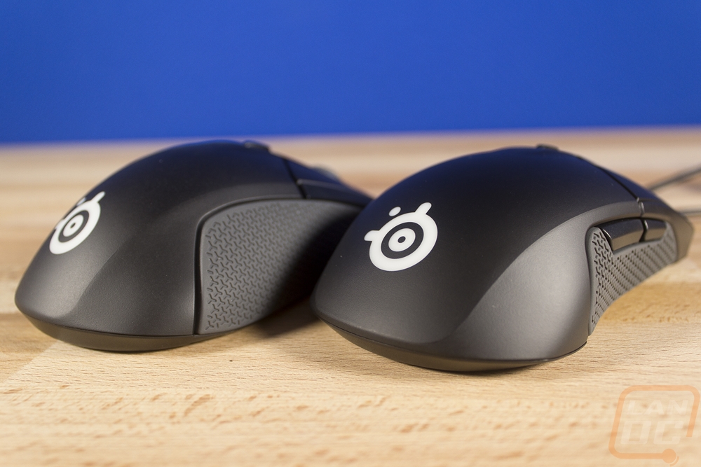
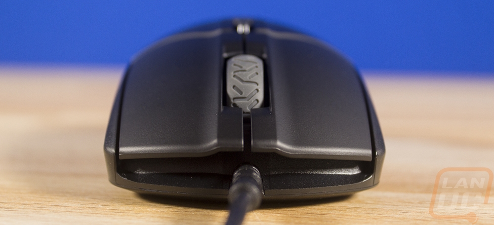
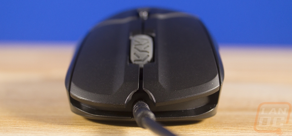
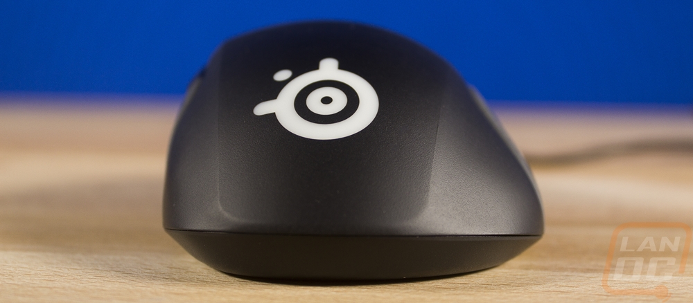
Okay for the front and back point of views I put them together because I wanted to highlight the difference in size from the back of the mouse to the front. The back point of view has a mostly rounded design that is, of course, the same on both sides. The SteelSeries logo is up under your palm and is bright white and backlit with RGB lighting. From the front we can see that up under the triggers they left a big gap. The only thing going on in that gap is the mouse cord coming out. They did, however, add a rubber pinch protector where the cord comes in where on the original it went in without protection, I can only assume this will help with reliability as well.
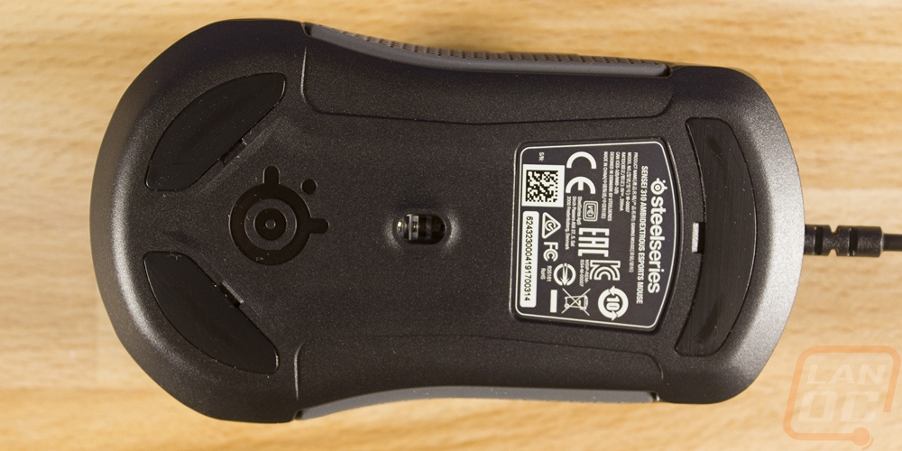
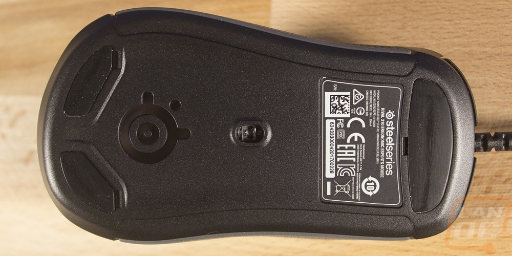
Okay up under the Sensei 310 we have a few things going on. As always there is a sticker with the model and serial number information along with all of the required certifications. The main two areas I was focusing on though were the gliders and the sensor. So for the gliders, they went with a new layout. You get two down at the base of the mouse in each corner and then a wide glider down under the triggers. Each has a defined area where you can get a tool up under them to remove them so I hope they plan on providing replacements in the future. There is a little less surface area than in the past, as someone with a heavy hand and a hard mouse pad I hope this won’t translate to accelerated wear.
As for the sensor, well frankly this is the main area that had to change with the original Sensei. Let's start with what the original Sensei had. Most of the models had an Avago 9500 and the MLG version had the 9800. This was a laser sensor and while it worked well it was known for having some acceleration issues. The 9500/9800 were popular sensors (as it used in a lot of mice) at the time but over the years things have changed. For starters, Avago sold their sensor division to Pixart. Also, there has been more and more of a push for better sensors and with that Optical sensors are now seen more. As a whole, they normally track better and people are finally getting over the marketing BS where laser is better than optical and higher DPI is always needed.
So what did SteelSeries go with on the 310? They didn’t just grab a standard sensor off the shelf. Officially they are calling this sensor the TrueMove3 and frankly I found that name a little confusing. For one it always makes me think of TrueMoo Milk but more importantly introducing the 3rd version first is confusing. From talking to SteelSeries they do plan on filling out their product line with more TrueMoo I mean TrueMove sensors so we can expect later on to see other sensors, the 3 is just the first one out. Moving past the marketing talk I did pester the product manager enough to find out if this was a Pixart 3360 based sensor and he did confirm that it is. The 3360 and its variations are extremely popular because of how well they perform. SteelSeries has worked with Pixart to tune the design slightly and rather than calling it something like a 3366 like Logitech did (come on guys 3369 was available!) they went with their own branding.
So what is different? Well, you may have seen them pushing the 1 to 1 tracking on social media ahead of this launch. This big goal was to raise up the 1 to 1 tracking to a higher CPI than other 3360 based mice. So the TrueMove3 will go 1-to-1 up to 3500 CPI and they are saying there is a lower response time. Overall the sensor specs are 12000 CPI, 350 IPS, and 50G of acceleration. IPS is the key here as that is the inches per second that you can move the mouse without losing information. A higher number here translates to better tracking with quick movements. The TLDR for those of you who skipped past my last few paragraphs of rambling would be SteelSeries upgraded the sensor to a highly improved design.
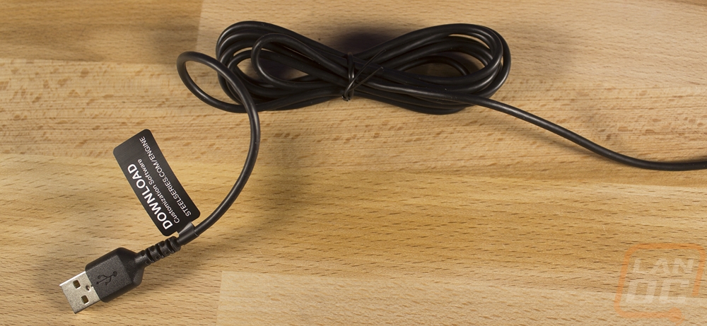
Last but not least we have the cord. They made a big change here as well. They dropped the sleeving all together and went with a simple smooth rubber cord design. As much as I love the look of sleeved cables, this is a great call for a mouse cord. It moves around a lot and if it rubs on the edge of a hard mouse pad or your desk the cord will fray. In addition, without the sleeving the cord has more flexibility, so unlike my original Sensei that I had to train the mouse cord to sit a specific way, this cord lays down smoothly.
Okay, next up we have the Rival 310. I will be touching on things a little less as a lot of the features on the Rival are the same as the Sensei. The top down look really lets us know what is different as well. We have the same split triggers, same new scroll wheel design, and the DPI button. Hell, even the body lines that run from the triggers back are the same. It's basically everything on the outside of those body lines that is different. This is an ergonomic design that is only for right handed users. We can see that because the two sides of the mouse are different and the right side really sticks out.
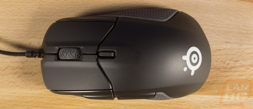

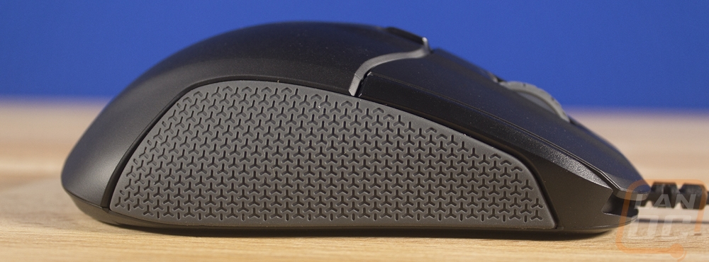
So both sides have the new silicon grips on the sides for longer life and better traction. The Rival 310 though only has buttons on the left side because it doesn’t need to support left handed users. So the right side of the mouse has a much larger grip. That same grip also doesn’t have the coke bottle shape of the Sensei that allows for gripping, instead it is designed in a way that your ring finger lays across the grip and your pinky holds it down on the side. The side buttons on the left are also much larger, just like the original Rival design. It's interesting to me that these buttons also have forward and back arrows on them but the Sensei didn’t.
The front profile of the Rival 310 shows how the entire mouse is higher on the left side, leaning towards the right. You can see it in the sly grin on the front. From the back, the middle area in between the body lines is mostly even, it's only when you get past that that the right side has a slow hill down, not the drop off with the slight coke bottle shape like the Sensei.
So the different shape of the mouse does show on the bottom of the Rival but it didn’t change the location of very much. In fact, the gliders look to be a touch smaller even with the additional space on the bottom. Well, at least the back gliders are. The top one is larger. They still have defined spots to get a tool under them for replacement and we still have the info sticker as well. As for the sensor, the Rival 310 uses the same TrueMove3 sensor as the Sensei 310. Please scroll up a few paragraphs and check out the LARGE wall of text I wrote on the sensor. Now the original Rival was newer and had the Pixart 3310 sensor, an early variation of the 3360 that this sensor is based on so the change isn’t as drastic as it is from the original Sensei to the 310, but it is still an improvement.
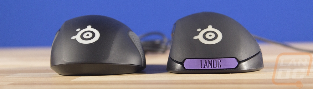
I couldn’t just talk about the new Rival and Sensei without digging out the originals for comparison. I took a few shots while checking them out. There were a few differences that I didn’t touch on up above. The picture below is the new Sensei 310 next to the Sensei RAW, not the original model but it has the same design. A few big differences here. The RAW has a rubber finish where the 310 has a satin plastic finish. This new finish is kind of a half way point between the raw with its soft grippy finish that was impossible to clean (as you can see in the photo, this was after cleaning it). The original Sensei, on the other hand, was glossy and would get oily. The new finish seems like a nice compromise. We can see that the DPI button is farther back on the 310. The shape is actually really close ignoring those body lines. The triggers aren’t as rounded as before but the overall length, width, and shape is closer than I expected.
The picture below has the original Sensei in the background and the 310 up front. Look up along the top edge and you can see that they did shave a mm or two off the top crown of the shape but it is mostly the same.
As for the original Rival to the Rival 310. Well, there were some changes to the Rival shape when they moved to the Rival 300 and I suspect that design is closer to the 310 but we can see a few changes here. The original Rival was noticeably taller for one. It also had that rubber finish that they have dropped. They dropped the name badges in the back of the mouse as well, as you can see I had done a few LanOC badges at one point. Most people didn’t use them though. Looking at the side profile there was more cut off the top than just a little height. Everything from the peak down the triggers was a little taller on the original and the 310 also sticks out a little at the back. Both changes lessen the overall arch shape. Then looking from the top down can see that the original Rival was also longer and has move curve to the side shape. The left side is now really straight where it used to curve in with a little of that “coke bottle” shape that I have mentioned to many times today.
To finish things up I also got a picture of the old style rubber grips on the Rival. You can really see how they are bumps sticking out of the rubber, not into the rubber like the new design. It is also interesting that my mouse is most likely one of the only original Rivals that has been used that isn’t completely falling apart on the side rubber. After testing for my review it went up and wasn’t really used so it didn’t break down from hand oils like the others.