Packaging
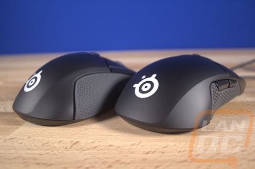
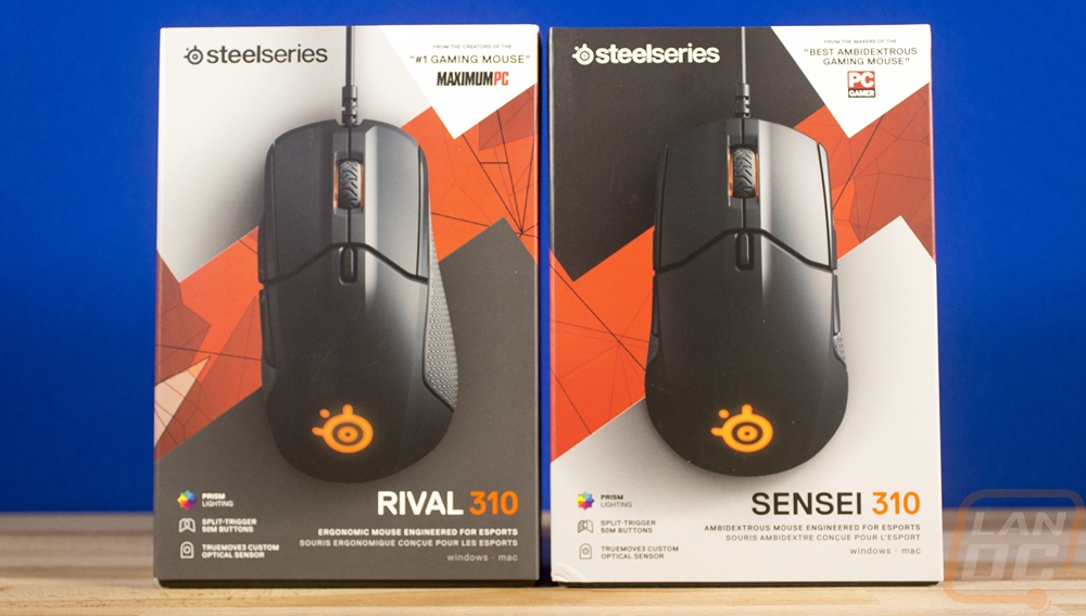
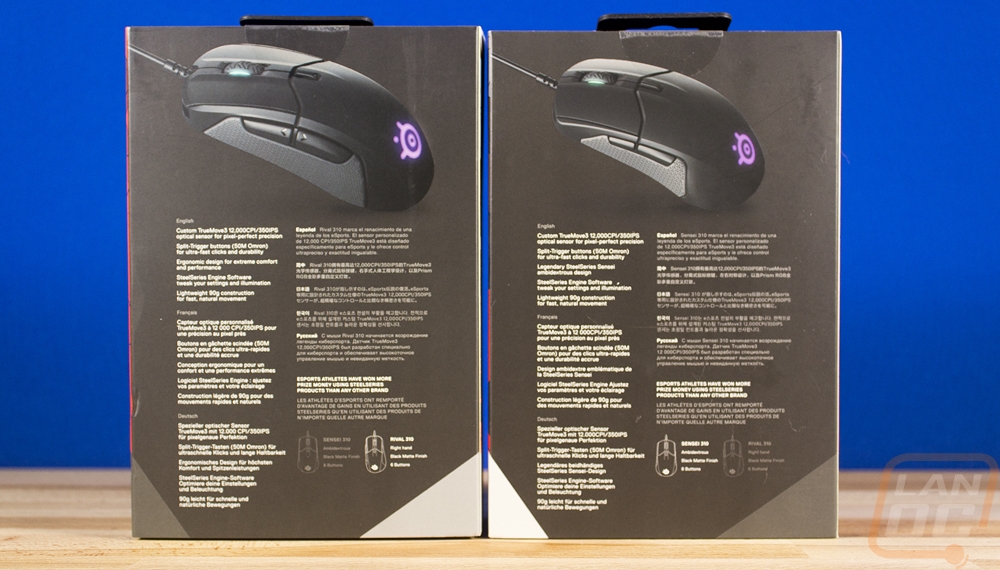
Because I’m taking a look a both mice today I figured why not open them up together. You can tell that the packaging was designed to be together. They both have a large top down photo of the mouse on the front with the same design in the background. Only they have flipped the black and white sections depending on the mouse. The branding is down in the bottom right corner and below that they point out that the Sensei is ambidextrous and the Rival is ergonomic. Then in the bottom left corner they point out the prism RGB lighting, the split trigger buttons, and the TrueMove3 sensor. On the back, they again have matching photos, even with the same RGB coloring. They touch a little more on the main features and then copy and paste them again in a few other languages.
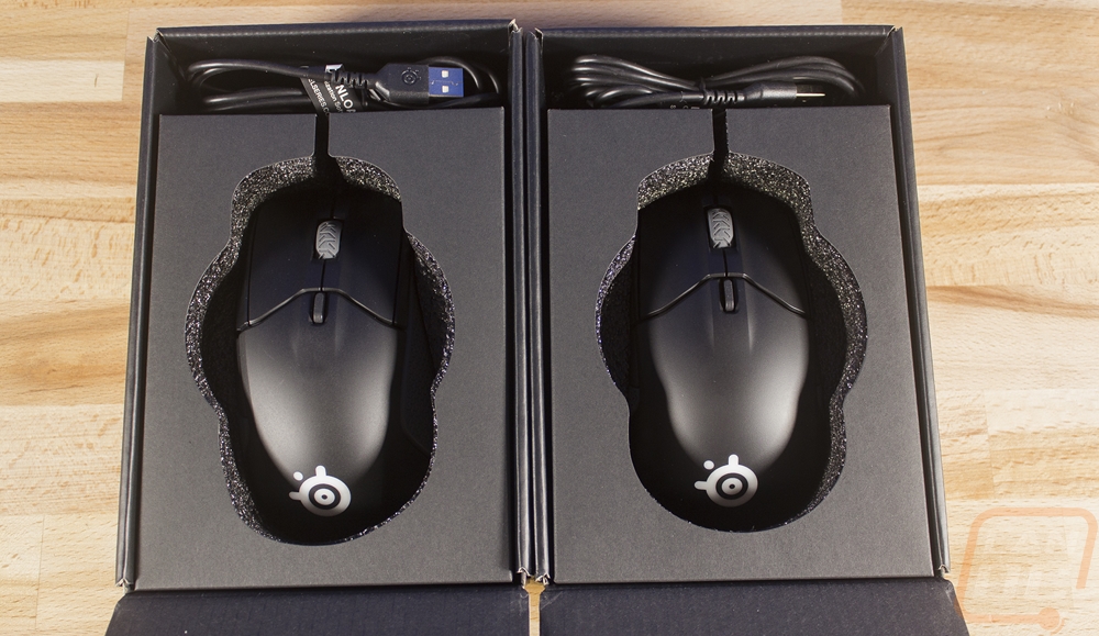
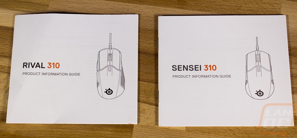
When you open everything up you will find a Rise Up message on the outside of the inner box with the SteelSeries logo on it. Then the cover opens up to show both mice in a foam tray cut to fit either design. The cord is wrapped up just above it and then they include a small information guide up under the foam tray.
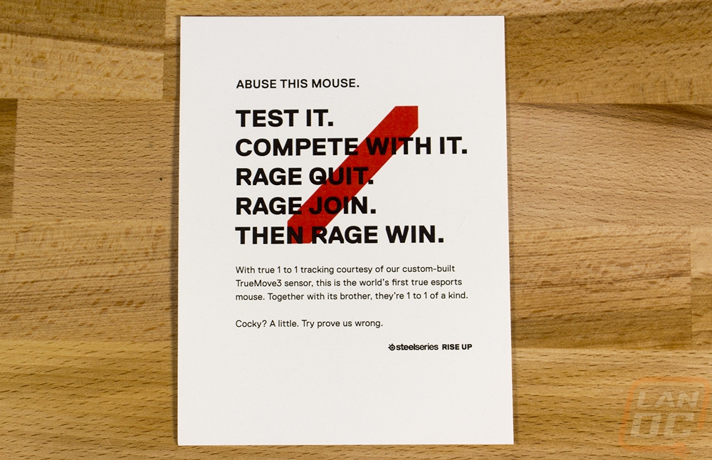
In the shipping packaging, the SteelSeries marketing team also slipped in a small card inviting testing and reviewers to abuse the mouse. Test it, Compete with it, Rage quit, Rage join, Then rage win. That’s a bold statement and I’m tempted to really beat the crap out of the mouse in my testing but I do have to be careful, they came in really late so I wouldn’t have time to get another in if I smashed it to bits.