Pictures and Features
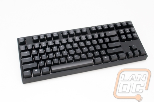
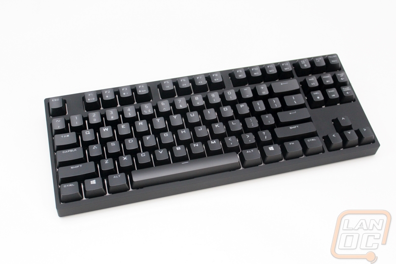
Without the Rapid-I being plugged in, my initial impressions of the keyboard were that it looks a lot like the standard Quickfire Rapid. That look is a little different than what I saw when I reviewed the Rapid back when it launched. Back then the Rapid had a silver shell with a little more Storm branding. Cooler Master cleaned up the styling with a satin black finish that gives the Rapid and Rapid-I a really clean look that will go well with just about anything. When you look straight down on the Rapid-I we can see that they went with a full white backplate, this should keep the LED backlighting really bright and it’s a nice touch when you can see it peaking around the keys. As with the original Rapid, the Rapid-I is a tenkeyless design meaning it doesn’t have the number pad over on the right side of the keyboard. Otherwise the layout is the same as a standard keyboard, and different than the Quickfire XT that I covered almost a year ago with its unique design with a number pad that doubled as the direction pad.
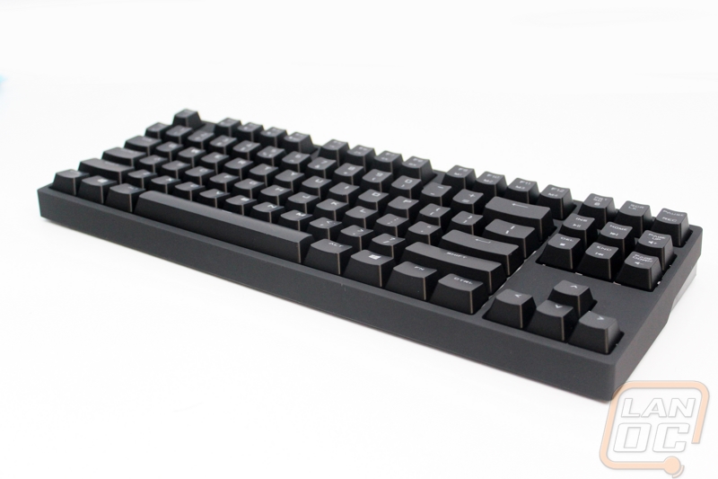
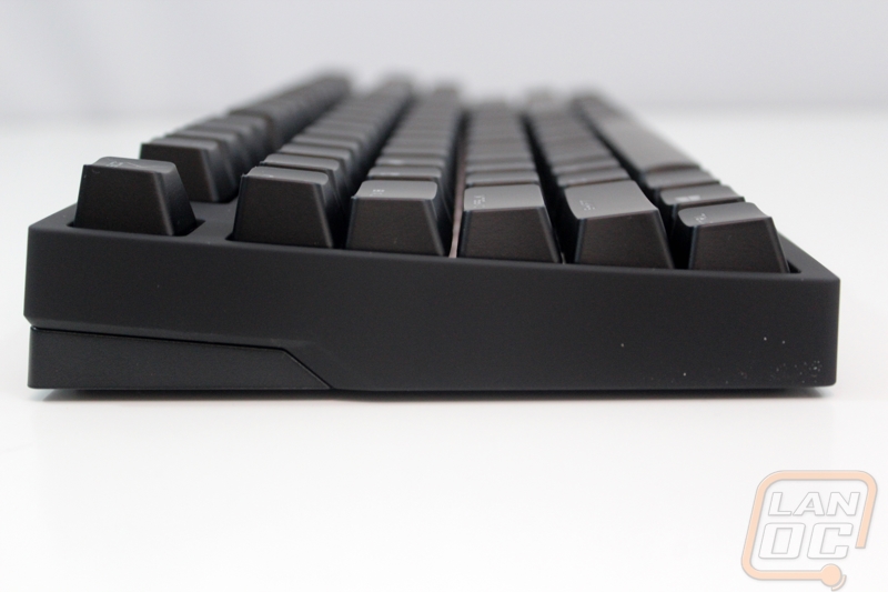
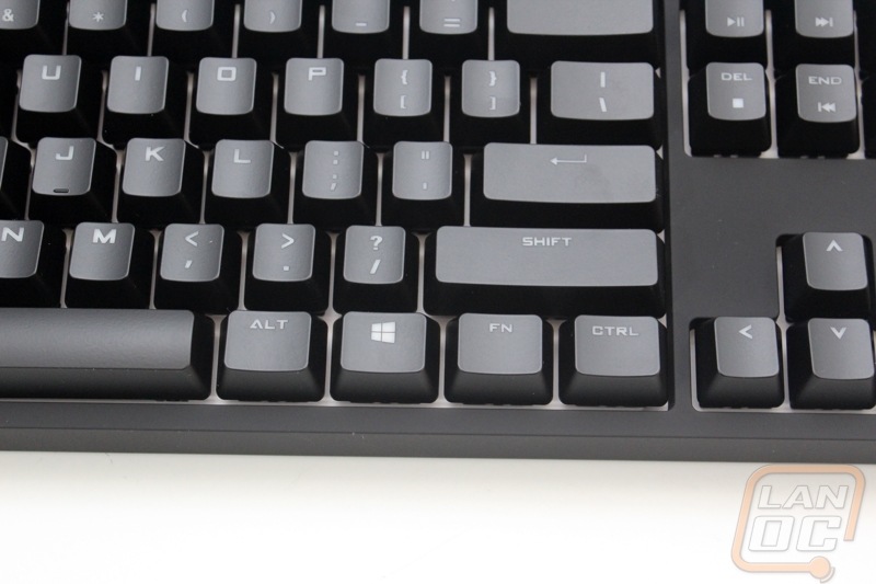
Taking a look from the side profile we can see that Cooler Master went with a standard key profile. The keyboard angles down but there is a slight concave in the key profile. This makes the keys a little easier to reach from the middle row.
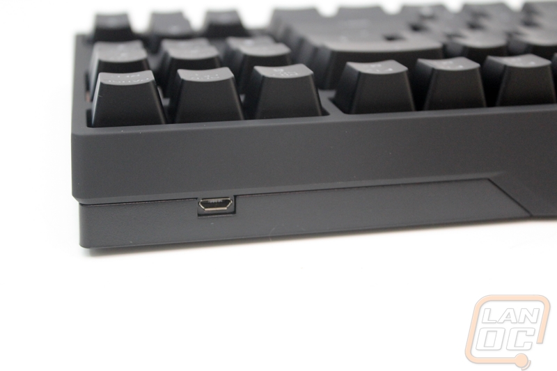
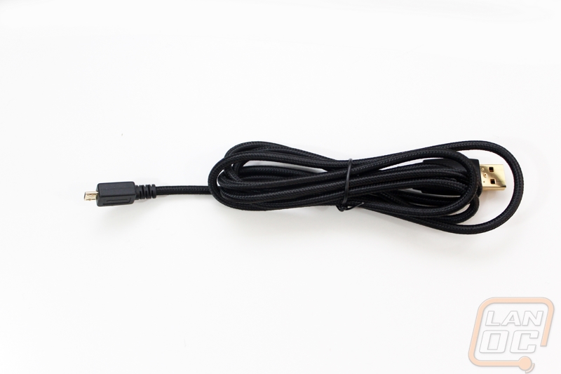
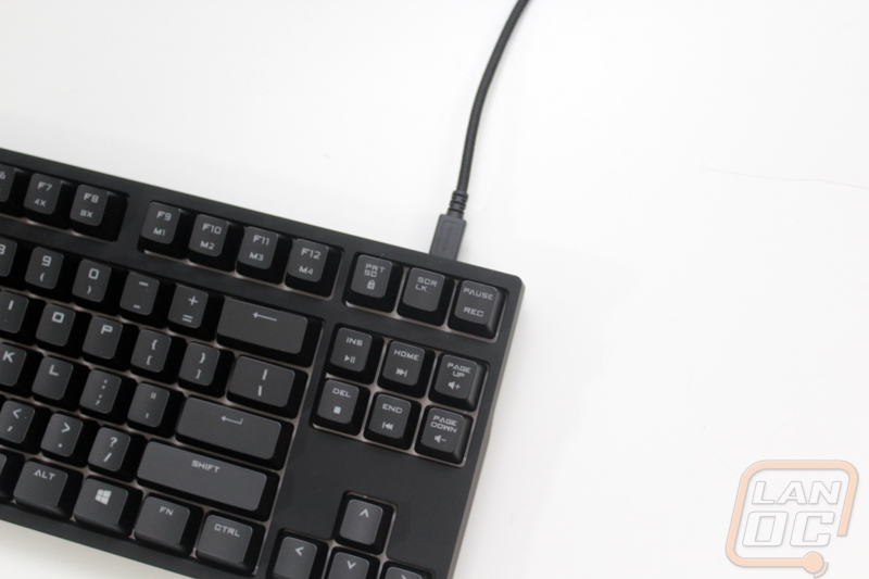
Like previous models the Rapid-I has a removable USB cord. They went with a micro USB over the Mini-USB that we normally see for removable keyboard cords. Not only is this a little smaller, but it is also more universal with almost every phone using the same connection. The cord itself has a heavy duty sleeving over top to for protection. The cable is a little hard to bend, like previous keyboard cords with a braided sleeving over them. This time though it is less of an issue, the previous Rapid plugged in under the keyboard and had a sharp bend right after it, with an external connection there is no issue.
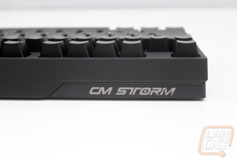
On the opposite side as the cord connection, Cooler Master slipped in the Rapid-I’s only visible branding. This is a LOT less than just about every other manufacture. Frankly you can’t even see the logo unless you turn the keyboard around.
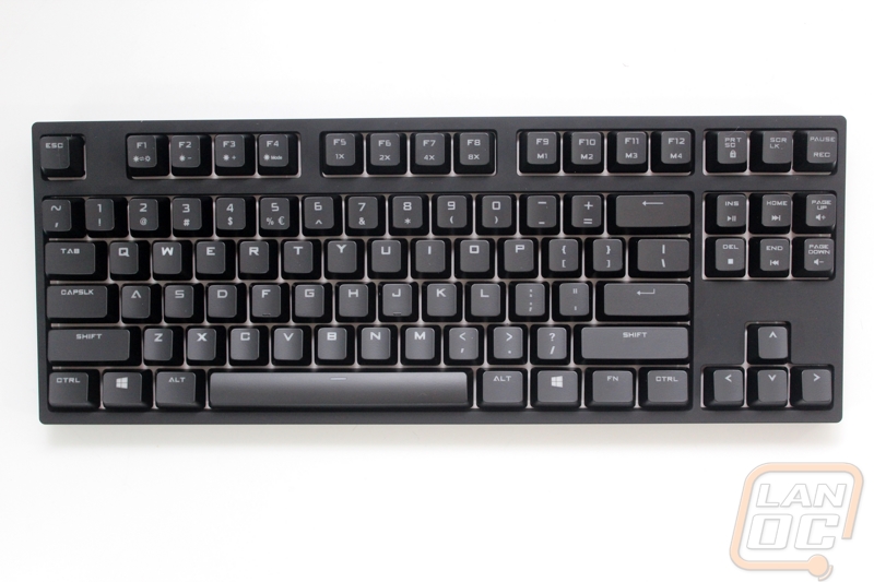
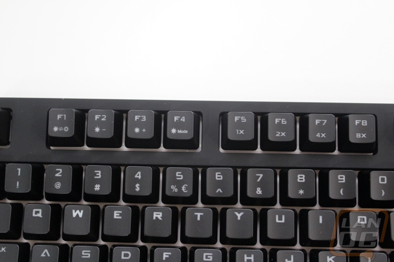
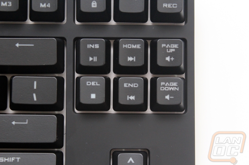
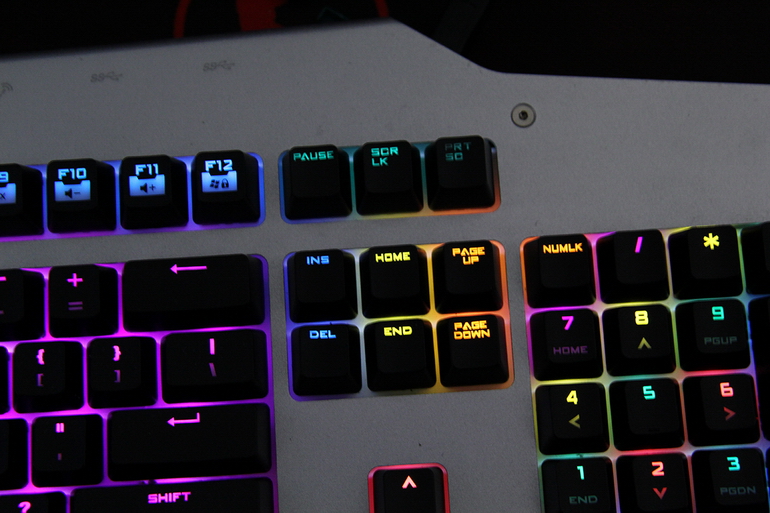
Like many other keyboards, the Rapid-I takes advantage of a function key to add functionality to the Rapid-I without having to pack it full of additional keys. When holding the function key all of the F keys function differently. The first set on the left (F1 to F4) turn backlighting on and off, change the backlighting brightness, and flip through the different lighting modes. The second set (F5 to F8) adjusts the repeat rate, aka x2 and up adjust a rapid fire mode for your keys. The rest of the F keys are all individual lighting profiles that you can program. On over you have a button for recording those light profiles and also a full set of media keys that double as the page up/down and home keys.
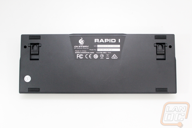
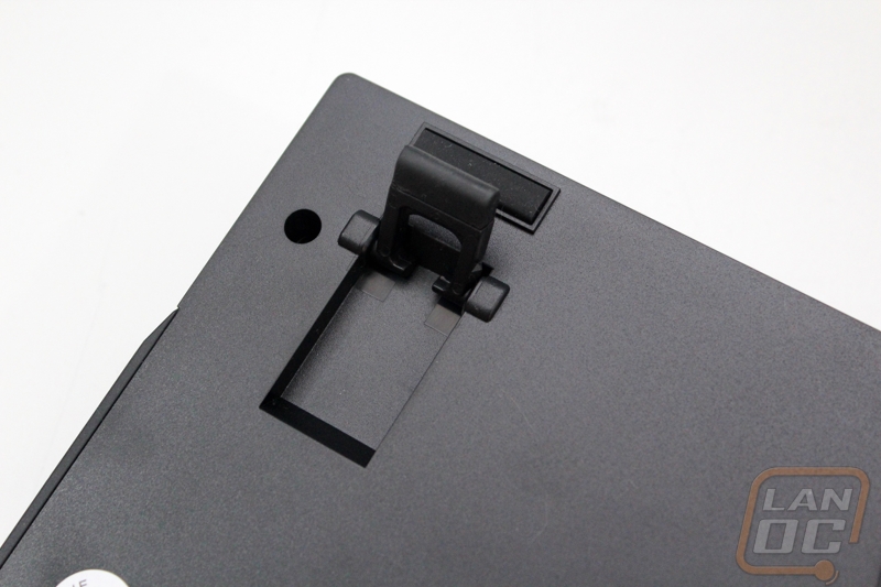
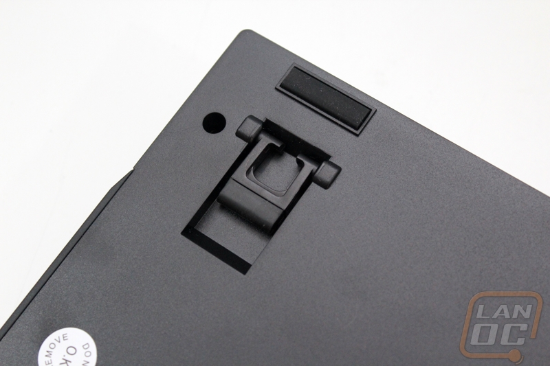
On the flip side of the Rapid-I Cooler Master has all of the required certifications on the name badge as well as the model and serial number. Each corner has a one-inch wide rubber foot to keep the Rapid-I secure. When you need more of an angle, each side has a flip out one-inch foot. The end of each foot is covered in rubber; this means using the feat doesn’t mean less traction.
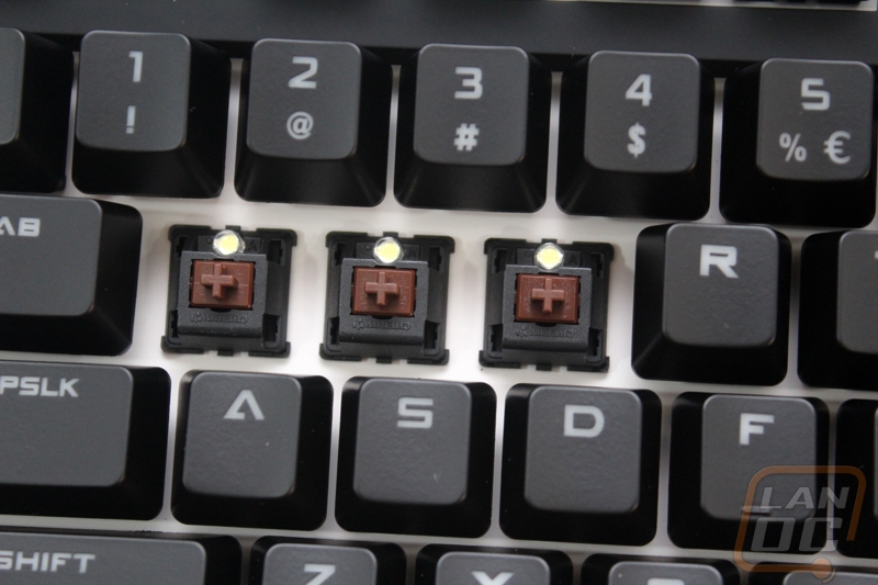
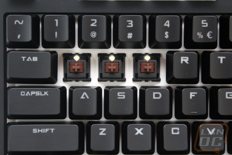
The Rapid-I is actually available with Cherry Blue, Red, and Brown switches. For my testing, this board has Cherry MX Browns. This works out perfectly because that is my preferred keyswitch, they give a good mix of tactile feedback while not being too noisy. Check out our article on how to pick your keyboard switch to learn more. For LED lighting the Rapid-I is only available with white backlighting, this looks great with blacked out design and is the most neutral lighting option. It will go with nearly any PC. In the pictures below you can also check out the white back plate that I mentioned before.
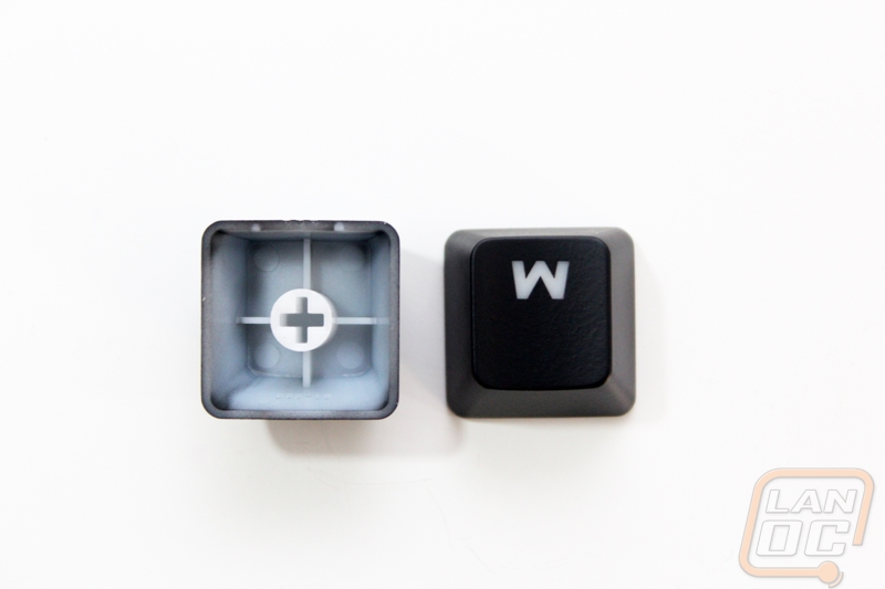
The keycaps on the Rapid-I are made out of ABS and “grip coated” according to Cooler Master. This is basically the same finish that their other keyboards have. The font is the same font that some people have complained about in the past, at this point I’ve seen it so much that I hardly notice it anymore. The only weird part is that the S and A as well as the numbers all are less bold than the rest of the letters.

")